
Making Data Sing at NIEER

- Information Architecture
- Content Strategy
- UX & UI Design
- Visual Design
- Web Development
Nonprofit leader the National Institute for Early Education Research has a clear mission: to improve education for young children across the U.S. An academic research center at Rutgers University, NIEER has a 20-year legacy of producing and sharing huge volumes of data to help guide policy. Our goal was to help NIEER make that shared information easy to find, explore and download in a post-PDF world.
First, Clarify
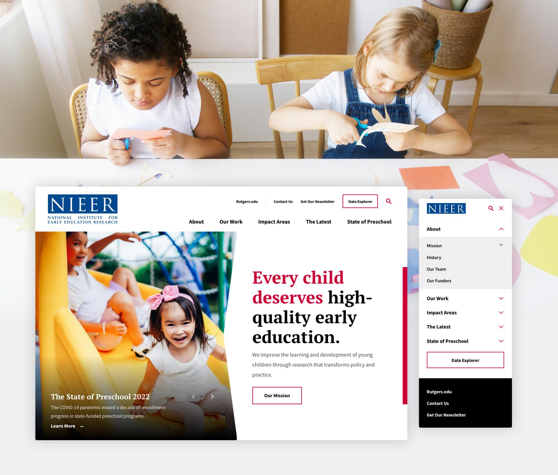
The more NIEER can get its data into the hands of the people who need it, the better. A poorly organized website was one thing that stood in the way. For a first-time visitor, it was unclear what the organization does, who it serves and how to access information. So we started out by simplifying and clarifying the UX, streamlining information organization to offer navigation pathways for the institute’s distinct audiences—the policymakers, advocates, researchers and academics whom the site aimed to empower.
Clear labeling was important. We introduced nomenclature across the site to improve clarity for all audiences.
Impact Hinges on Useability
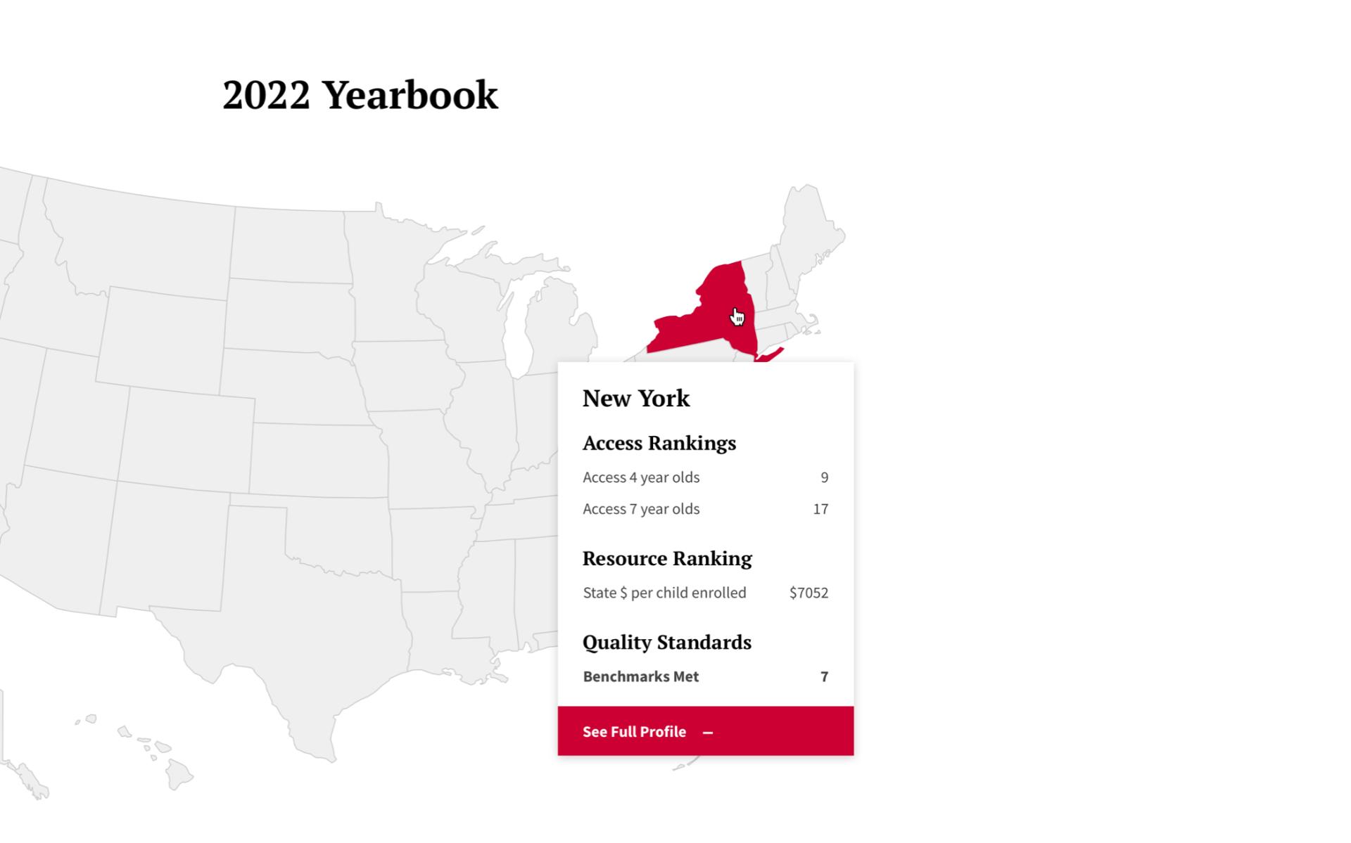
NIEER’s key product, the State of Preschool Yearbook, has tracked data on state-funded preschool programs annually since 2001 with the goal of equipping policymakers and advocates to make informed decisions about early childhood education in their states. But for years, NIEER.org users looking for relevant data had to sleuth through dozens of PDFs representing two decades of the Yearbook and other reports. Who has that kind of time?
NIEER’s determination to give researchers access to the underlying data inspired us to create a suite of custom analysis and visualization enhancements to the main report experience.
So, as part of our site redesign, Digital Pulp gave audiences an interactive version of NIEER’s annual preschool report.
- We created a set of features and functionality that would allow researchers to examine, analyze and customize the most important underlying data.
- We introduced more meaningful interactions and visualizations that would make the data much more accessible.
- An interactive U.S. map allows users to see key state-by-state data points on hover, or to quickly navigate to the full data set per state.
All NIEER research is now organized into a filterable, searchable database: a research library. Twenty years of meaningful data within published journal articles, newsletters, policy briefs, and research reports is now easily accessible with a few clicks.
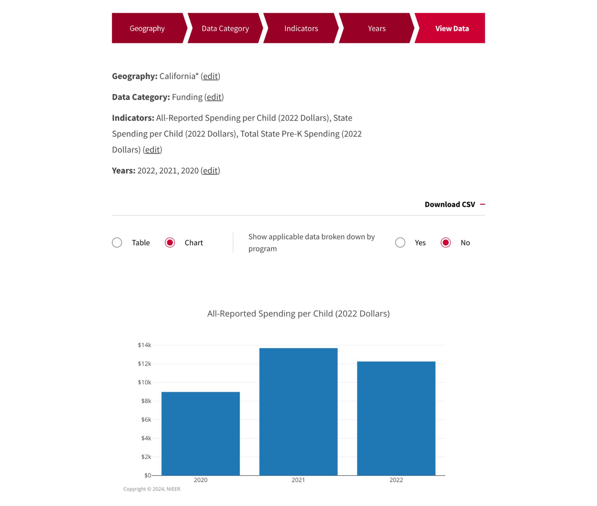
The Data Explorer: Empowering Researchers
Previously trapped in the prison of huge PDF documents, top line data was difficult to mine. We developed an entirely new feature set with the introduction of the Data Explorer. A key goal was to allow researchers and advocates to easily find data relevant to their area of expertise from the Yearbook’s 20 years, and to download pre-configured data sets across trending topics for sharing with change-makers to influence policy.
A simple step-by-step form gives users the power to compare key data points across different states, years, and program benchmarks; generate a table or chart; and download the source files or export as images. These data sets can easily be woven into reports, briefs, and proposals that inform key stakeholders.
Elevating the Brand
While our user experience team worked on creating a digital experience for NIEER’s audiences, our designers created a distinct visual design that elevates the institute’s brand, while highlighting its connection as a research center under the Rutgers Graduate School of Education.
Digital Pulp had recently redesigned an entire ecosystem of Rutgers sites and created a web-builder system, the Rutgers Core Component Library, that entities across the system have since used to quickly and economically stand up new sites. But the CCL system couldn't meet the needs of an organization as specialized as NIEER, so we applied its visual system to the Institute's analytical tools.
The result: a site with a unique component set that still looks seamlessly integrated within the Rutgers' digital landscape; and a user experience and set of tools that make it easy for researchers, advocates and policymakers to steer early childhood education toward a better future.