Redefining a Women’s College

Most people who know something about top rung colleges know something about Barnard. It’s a women’s college, one of the seven sisters. It’s a liberal arts school that graduates lots of great writers. It’s exclusive. It’s not Columbia. Barnard wanted to change people’s perceptions to reflect the real Barnard: unique, complex, and very relevant to this moment in history.
The Challenge
Shifting the narrative is never easy. For Barnard, it would mean discovering the school’s essence and permeating the site with it linguistically, visually and architecturally, as well as through storytelling.
Barnard College is not simply a women’s college and not simply a liberal arts school. It’s full-on New York City, with all the opportunities and bold personality that implies. Its relationship with Columbia is co-equal and benefits students on both sides of Broadway. The school is leading the way in STEM and it has moved way past diversity to embrace inclusion of all marginalized communities. Most important, Barnard women make big waves. Impact is in the school’s DNA.
But the Barnard website wasn’t telling it like it is. It lacked the spark; it said “bold” but didn’t evoke it; it was dated and downplayed Barnard’s impact on the world. What’s more, the site was hard to navigate, and some of the most evocative content was buried under levels of detail that prospective students—the number one target audience—didn’t need. How does it feel to be a student at Barnard? Who knew.
Our challenge was to create a site that presents the school as the dynamic, forward thinking, deeply considered place that it is; a place occupied by sharp, fierce people bringing a wide range of lived experiences to bear on the project of redefining what it means to be an institution for women and by women in the 21st century.
The Solution
Our discovery process was crucial to meeting the challenge. We spoke to a large swath of stakeholders, from prospective students to leadership. Then we dived deeper. We dug into the Barnard archives, poured over student blogs and joined a student-led campus tour, where we witnessed the concerns of high schoolers and picked up the inside story of campus life. We later wove those minutiae across the site, giving it that real-life feeling Gen Z craves.
Our discovery process resulted in an overarching strategy: Because Barnard raises students to be agents of change and amplifies their voices, let the stories of students and alumni do the talking.
One of our core deliverables was a comprehensive Voice & Tone Guide. This document is both aspirational—who we are, what we believe, what we say about ourselves—and practical. Writers and editors use the Guide to steer content. And it guides many of our processes internally at Digital Pulp, too. Our Voice & Tone Guide for Barnard captured the school’s smart, slightly edgy personality and informed our deeper content strategy and deliverables: an editorial vision, a structured content plan, a strategy for microcopy, and an intuitive information architecture that tells the Barnard story right up front.

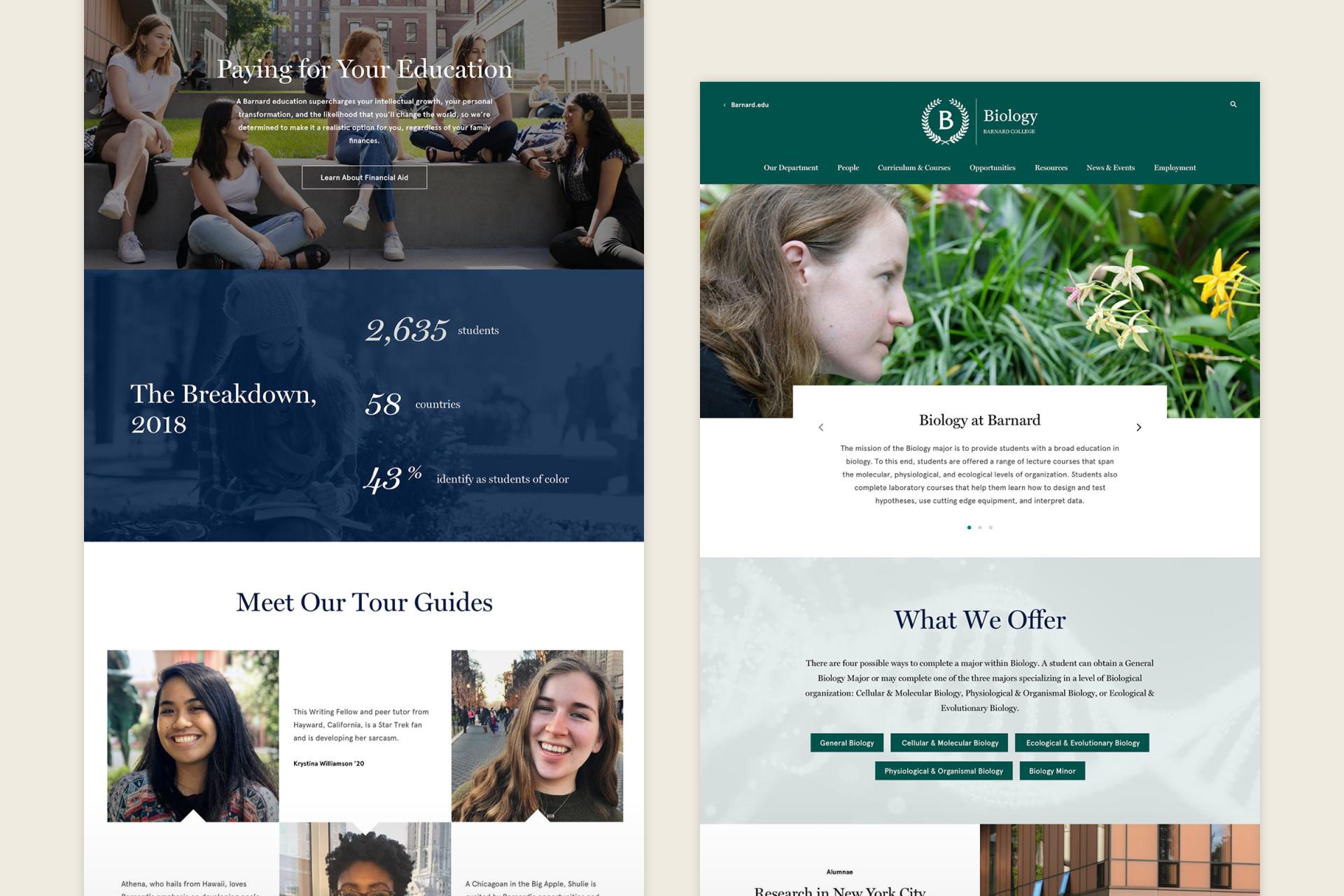
Digital Pulp’s UX and content strategy teams worked together closely to craft content types and components that give the site a chance to air the school’s particular culture and strengths through quick-take first person insights. Any higher education marketing site has to feel relevant to a generation of students soaked in social media. That means bite-size content, personal opinions and authenticity. We also take care on every project to factor in resource management: We wanted to create models that would be a light lift for Barnard’s small internal team to manage.
When the client asked us to develop content for a few dozen of the site’s top-level marketing pages, we jumped on the chance to apply the voice and tone on pages that have to distill a lot of messaging into short, chunky copy blocks. We also were keen to show how the flexible, componentized system we’d built could be maximized to tell the Barnard story succinctly, directly and evocatively. The top-level pages we created took some of the pressure off the internal teams and also served as examples for how to create component stacks that offer users those those aha moments Barnard was looking for.
The new site presented a challenge for technology, too, with a replatform from Drupal 7 to Drupal 8—essentially a whole new site. Provisions for a new and improved faculty search, a focus on elegantly surfacing events, a robust solution for program and department content, and a big migration of legacy magazine content were all part of the technical plan. Also, of course, it was critical for the new site to work perfectly on all mobile screens and meet WCAG 2.1 Level AA criteria.

The Result
We worked closely with our client to produce a site that tells Barnard’s nuanced and complicated story, and that reflects the school’s impact on students and the world, its remarkable history, and its relevance today. It’s an intuitive site that invites users to explore and discover while allowing more deliberate information seekers to quickly find what they’re looking for. And by focusing on Barnard women and their voices, it sends a clear message: We are in the driver’s seat, and we’re driving change.
Awards and Acclaim
2020 W3 Award - Gold
2019 Acquia Engage Awards - Leader of the Pack, Education